Category
page 2Typography
indentation
empty space at the beginning of a line to signal the start of a new paragraph
section
subdivision of a chapter in a book
snake case
The general term for the notation where multiple words are concatenated with underscores ("_") for specific purposes, such as making word boundaries more visible after combining multiple words into a single string, with all letters in lowercase
baseline
line in typography upon which most letters "sit" and below which descenders extend
zero-width space
zero-width space (U+200B), commonly abbreviated “ZWSP”, intended for invisible word separation and for line break control; it has no width, but its presence between two characters does not prevent increased letter spacing in justification
tombstone
symbol used in mathematics and typography
text figures
numerals designed with varying heights with asecenders and descenders
subscript and superscript
a character (such as a number or letter) that is set slightly below and above the normal line of type, respectively

rubric
thumb|Dominican Rite|Dominican [[Missal, c. 1240, with rubrics in red (Historical Museum of Lausanne)]]
thumb|Rubrics in an illuminated gradual of c. 1500
A rubric is a word or section of text that is traditionally written or printed in red ink for emphasis. The word derives from the Latin , meaning red ochre or red chalk, and originates in medieval illuminated manuscripts from the 13th century or earlier. In these, red letters were used to highlight initial capitals (particularly of psalms), section headings and names of religious significance, a practice known as rubrication, which was a sep
typefounding matrix
copper block acting as a mould for making movable characters or raised letters on a hard support
all caps
text containing only uppercase letters or manner to write using only uppercase (capital) letters (due to need for emphasis, technical limits or any other reason)
Sujud Tilawa
prostration (sujud) which occurs during the ritual Tilawa of Quran in Salah or outside it
slab-serif typeface
style of typeface with thick, rectangular serifs

kasheeda
Kashida or kasheeda (, ), also known as tatweel or tatwīl (), is a type of justification in written Arabic scripts, in which the line connecting letters is extended. In contrast to white-space justification, which increases the length of a line of text by expanding spaces between words or individual letters, kasheeda creates justification by elongating characters at certain points. Kasheeda justification can be combined with white-space justification.
zero-width joiner
zero-width joiner (U+200D), commonly abbreviated “ZWJ”: non-printing format control used for the conjoined composition of character sequences needed in some complex scripts and emojis
pica
unit of length
letter spacing
physical spacing of visible character glyphs of a text rendered on a support
river
gaps in typesetting, which appear to run through a paragraph of text, due to a coincidental alignment of spaces

allograph
thumb| rendered with or without a looptail are allographs of each other|class=skin-invert-image
.jpg)
lettering
thumb|Custom lettering on the spine of a 1960s book
Lettering or handlettering is a term for artfully drawing letters, instead of writing them simply. Each letter is created with attention to detail and has a unique role within a composition. Lettering is created as an image, with letters that are meant to be used in a unique configuration. Lettering words do not always translate into alphabets that can later be used in a typeface, since they are created with a specific word in mind.
Roman type
style of typeface based on Carolingian miniscule combined with Roman square capitals

microprinting
Microprinting is the production of recognizable patterns or characters in a printed medium at a scale that typically requires magnification to read with the naked eye. To the unaided eye, the text may appear as a solid line. Attempts to reproduce by methods of photocopy, image scanning, or pantograph typically translate as a dotted or solid line, unless the reproduction method can identify and recreate patterns to such scale. Microprint is predominantly used as an anti-counterfeiting technique, due to its inability to be easily reproduced by widespread digital methods.
page number
number itself, which may appear in various places on the page
oblique type
form of type that slants slightly to the right
zero-width non-joiner
zero-width non-joiner (U+200C), commonly abbreviated “ZWNJ”: non-printing format control character used to prevent joining adjacent characters, to render them with visually separated forms, without ligature between them
counter
white space that is wholly enclosed by the stroke of a handwritten or typographic letterform
grid
used in graphic design to guide objects

dingbat
thumb|right|Poem typeset with generous use of decorative dingbats around the edges (1880s). Dingbats are not part of the text.
page footer
page section located under the main text

capitalisation
right|thumb|The capital letter "A" in the Latin alphabet, followed by its lowercase equivalent, in sans serif and [[serif typefaces respectively|class=skin-invert-image]]
typographic alignment
the setting of text flow or image placement relative to a page, column, table cell, or tab
R rotunda
historical variant of the Latin letter R

wordmark
A wordmark or word mark is a text-only statement of the name of a product, service, company, organization, or institution that is used for purposes of identification and branding. A wordmark can be an actual word (e.g., Apple), a made-up term that reads like a word (e.g., iPhone), or an acronym, initialism, or series of letters (e.g., IBM). In some jurisdictions a wordmark may be trademarked, giving it legal distinction, and potentially additional protection of any artistic presentation.
body text
text forming the main content of a printed or digital work (as opposed to additional elements such as headlines, images, charts, footnotes)
Bibliotheca Teubneriana
Series of classical texts
Didone
serif typeface genre popular during the 19th century with narrow unbracketed serifs, vertical orientation of weight axes, strong contrast between thick and thin lines and ball terminals
emphasis
strengthening of words in a text with a font in a different style from the rest of the text
script typeface
class of typefaces inspired by handwriting
swash
a typographical flourish found on some letterforms, particularly in italics

Faux Cyrillic
using Cyrillic letters to represent Latin ones

column
typography
typographic unit
unit of measurement used in typography or typesetting

word wrap
feature of continuing on a new line when a line is full
International Typographic Association
The ATypI () or Association Typographique Internationale (the International Typography Association) is an international non-profit organisation dedicated to typography and type design. The primary activity of the association is an annual conference, held in a different global city each year.

strikethrough
thumb|An example of strikethrough

Abecedarium
thumb|The Anglo-Saxon futhorc (abecedarium anguliscum)
thumb|An Early Cyrillic abecedarium on birch bark document № 591 from ancient [[Novgorod (Russia). Dated to 1025–1050 AD.]]
thumb|Folio 1 of the Codex Gigas, showing Hebrew, Greek, Latin, Glagolitic, and Early Cyrillic abecedaria
An abecedarium (also known as an abecedary or ABCs or simply an ABC) is an inscription consisting of the letters of an alphabet, almost always listed in order. Typically, abecedaria (or abecedaries) are practice exercises.
ink trap
a sharp recess in an inward corner, present in certain typefaces; when printed, ink fills them
soft hyphen
soft hyphen (U+00AD): format control character normally invisible, which indicates a break position within a word; if the word break is applied, the character is displayed as a hyphen at end of line before the break
twip
A twip (abbreviating "twentieth of a point" or "twentieth of an inch point") is a typographical measurement, defined as of a typographical point. One twip is inch, or 17.64 μm.
type design
art of designing typefaces and fonts
form
element os printing techniques
kinetic typography
style of animation mixing text and motion
haplography
Haplography (from Greek: haplo- 'single' + -graphy 'writing'), also known as lipography (from Greek: lip- from leipein 'to leave/to omit' + -graphy 'writing'), is a scribal or typographical error where a letter or group of letters that should be written twice is written once. It is not to be confused with haplology, where a phoneme is omitted to prevent two similar sounds from occurring consecutively: the former is a textual error, while the latter is a phonological process.
typometer
thumb|Illustration of a typometer. The upper edge is marked with millimeters, half centimeters and centimeters; the lower edge is marked with a Point (typography)|typographic point scale in groups of three, six and twelve points (one quarter cicero, half a cicero and one cicero)
thumb|Front and back of an old metal typometer with a hook for manual type setting
thumb|Plastic typometers, from the 1980s, with different scales
cap height
the height of an uppercase letter in a font
composing stick
in typesetting, a tray-like tool used to assemble pieces of metal type into words and lines
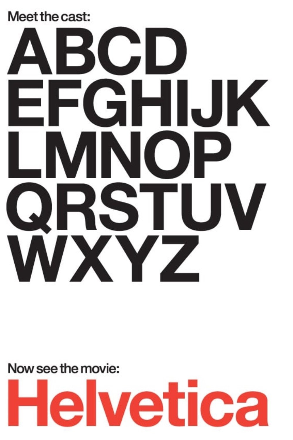
Helvetica
2007 documentary film directed by Gary Hustwit
Antiqua-Fraktur dispute
typographical dispute in 19th- and early 20th-century Germany
leader
row of dots used in tables of contents
overline
{| class="wikitable" style="float:right"
|-
! Description || Sample || Unicode || CSS/HTML
|-
| Overline(markup)
| ||
| style="font-size:75%" | text-decoration: overline;
|-
| rowspan="2" | Overline(character)
| ‾ || U+203E || ‾, ‾
|-
| X̅x̅ (combining) || U+0305 || X̅
|-
| Double overline(markup)
| Xx ||
| style="font-size:75%" | text-decoration: overline; text-decoration-style: double;
|-
| Double overline(character)
| X̿x̿ (combining) || U+033F || X̿
|-
| rowspan="3" | Macron(character)
| ¯ || U+00AF || ¯, ¯