Category
page 1Typography

writing system
any conventional method of visually representing verbal or signed communication
letter
grapheme in an alphabetic system of writing

printer
computer peripheral that prints text or graphics

Latin alphabet
alphabet used to write the Roman Latin language, then adapted and used in most languages of the world

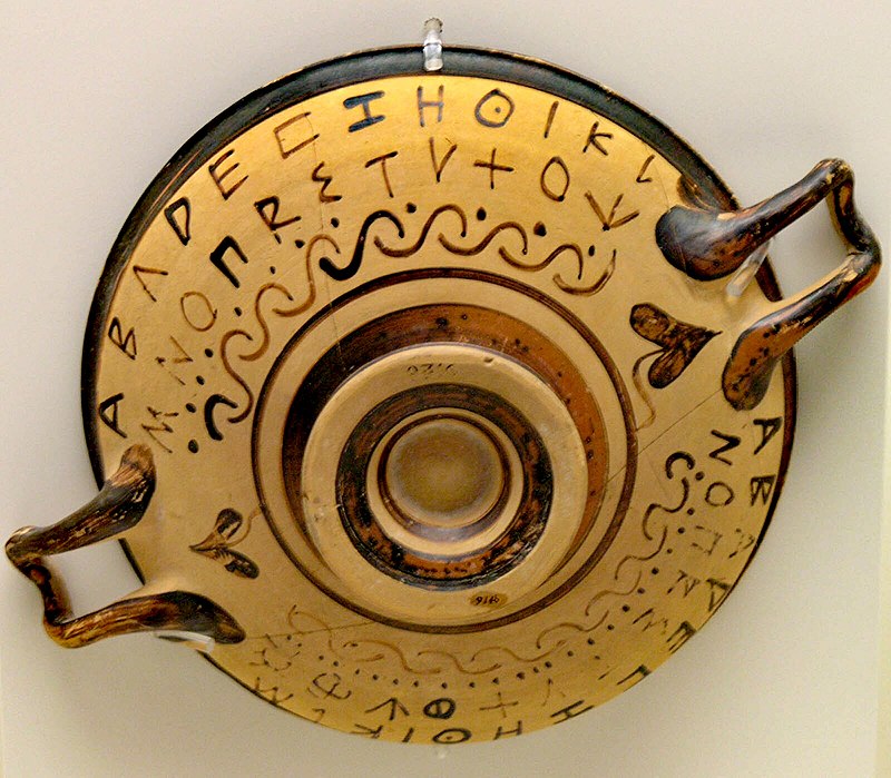
Phoenician script
abjad found in Canaanite and Aramaic inscriptions across the Mediterranean from the 11th–2nd centuries BCE
.svg)
punctuation
Punctuation marks are marks indicating how a piece of written text should be read (silently or aloud) and, consequently, understood. The oldest known examples of punctuation marks were found in the Mesha Stele from the 9th century BC, consisting of points between the words and horizontal strokes between sections. The alphabet-based writing began with no spaces, no capitalization, no vowels (see abjad), and with only a few punctuation marks, as it was mostly aimed at recording business transactions. Only with the Greek playwrights (such as Euripides and Aristophanes) did the ends of sentences b

typography
thumb|right|225px|A specimen sheet of the Trajan (typeface)|Trajan typeface, which is based on the letter forms of or [[Roman square capitals used for the inscription at the base of Trajan's Column, from which the typeface takes its name]]
thumb|right|225px|Movable type being assembled on a [[composing stick using pieces that are stored in the type case shown below it]]

diacritic
thumb|class=skin-invert-image|Latin letter A with multiple diacritics

dash
The dash is a punctuation mark consisting of a long horizontal line. It is similar in appearance to the hyphen but is longer and sometimes higher from the baseline. The most common versions are the endash , generally longer than the hyphen but shorter than the minus sign; the emdash , longer than either the en dash or the minus sign; and the horizontalbar , whose length varies across typefaces but tends to be between those of the en and em dashes.

grapheme
thumb|Various glyphs representing instances of the lower case letter , considered to be [[allographs of the same grapheme|class=skin-invert-image]]

paragraph
A paragraph (from Ancient Greek παράγραφος (parágraphos) 'to write beside') is a self-contained unit of discourse in writing dealing with a particular point or idea. Though not required by the orthographic conventions of any language with a writing system, paragraphs are a conventional means of organizing extended segments of prose.

pangram
A pangram, or holoalphabetic sentence, phrase, or word, is a sentence, phrase, or word using every letter of a given alphabet at least once. Pangrams have been used to display typefaces, test equipment, and develop skills in handwriting, calligraphy, and typing.
.svg)
font
thumb|The Bauer Bodoni typeface, with samples of the three of the fonts in the family: Roman (or regular), bold, and italic.|class=skin-invert-image

ligature
glyph resulting from the orthographic combination or calligraphic ornementation of two or more basic letter forms into a single typographic or handwritten character
glyph
thumb|Various glyphs representing lower case letter in various typefaces and as single- and double-storey; they are allographs of the same [[grapheme|class=skin-invert-image]]

offset printing
printing technique where an inked image is transferred from plate to printing surface via a rubber blanket
space
blank area that separates words, sentences, syllables, or other written or printed glyphs; precise typographical rules differ according to language and context

typeface
thumb|A Specimen, a broadsheet with examples of typefaces and fonts available. Printed by William Caslon, letter founder; from the 1728 Cyclopædia.

sujud
Sujud (, ), or sajdah (, ), also known as sijda, sejda or shejda, in Islam is the act of low bowing or prostration to God facing the qiblah (direction of the Kaaba at Mecca). It is usually done in standardized prayers (salah). The position involves kneeling and bowing till one touches the ground with seven bones (points): the forehead and nose, two hands, two knees and two sets of toes. In accordance with the Sunnah (the Way) of Muhammad, one's elbows should be far from one's body, unless it causes discomfort to other worshippers, but not resting on the ground. Some scholars hold the position
italic
font style characterised by cursive typeface and slanted design

serif
{| style="float: right; margin: 0 1em 1em; border: solid 1px black;"
| class=skin-invert-image
| Sans-serif font
|-
| class=skin-invert-image
| Serif font
|-
| class=skin-invert-image
| Serif font (red serifs)
|}

desktop publishing
creation of documents using page layout skills on a personal computer

Serbian Cyrillic alphabet
official script of Serbian language

blackletter
Blackletter (also black letter or sometimes black-letter; sometimes popularly known as Gothic minuscule or Gothic type) was originally a medieval book hand (Textualis or Textura) of the Gothic family of scripts, later adapted into typefaces and still used in modern calligraphy and typesetting.

initial
thumb|A historiated initial (the letter O) from an illuminated manuscript|alt=A large letter O in a frame. At the centre of the letter, there is an illustration of Moses receiving the Ten Commandments on tablets of stone.
colophon
brief statement of a book's own information, such as publisher, location, and date of publication
page
unit of extent that consists of a single side of a leaf
title page
page at or near the front of a book on which its title, subtitle, author, publisher, and edition is displayed
camel case
term for the notation where uppercase letters are used within words for specific purposes, such as making word boundaries visible after concatenating multiple words into a single string, with the first word's initial letter in lowercase
frontispiece
illustration facing a book's title page

typesetting
thumb|right|upright=1.35|Movable type on a [[composing stick on a type case]]
thumb|bottom|A specimen sheet issued by William Caslon, letter founder, from the 1728 edition of CyclopaediaTypesetting is the composition of text for publication, display, or distribution by means of arranging physical type (or sort) in mechanical systems or glyphs in digital systems representing characters (letters and other symbols). Stored types are retrieved and ordered according to a language's orthography for visual display. Typesetting requires one or more fonts (which are widely but erroneously confused with
point
measurement unit used in typography
sort
block with a typographic character etched on it, used to print text
sans-serif typeface
thumb|class=skin-invert|Sans-serif typeface
thumb|class=skin-invert|Serif typeface
thumb|class=skin-invert|Serifs(coloured in red)
thumb|From left to right: a Ming (typefaces)|Ming serif typeface with serifs in red, a Ming serif typeface and an East Asian gothic sans-serif typeface
typographical error
mistake made in typing printed material

underscore
thumb|right|Underlining was developed for mechanical machines like this Underwood Typewriter Company|Underwood typewriter which had no bold or [[italic type. The only way to emphasize text that was typewritten was to back up the carriage and type underscores beneath the text. Underlining was a workaround for shortcomings in typewriter technology.]]
thumb|right|Underscored or underlined text.
An underscore or underline is a line drawn under a segment of text. In proofreading, underscoring is a convention that says "set this text in italic type", traditionally used on manuscript or typescript as
ſ
archaic form of the Latin letter S (ſ)

kerning
thumb|Kerning brings A and V closer, with their serifs over each other.
thumb|right|alt=Top: The word "FLICK" in all caps, typeset in sans-serif. Bottom: With reduced spacing between letters, the L and I appear to merge together into a U, causing the word to instead read as "FUCK".|Poor kerning (referred to informally as keming) may, in a worst-case scenario, result in unwanted words being read.
In typography, kerning is the process of adjusting the space between two specific characters, or letterforms, in a font. It is not to be confused with tracking, by which spacing is adjusted uniformly o
linotype machine
printing machine used in hot type
letterpress printing
technique of relief printing using a printing press
small caps
typeset that contains characters that resemble uppercase letters
movable type
system of printing and typography that uses movable components
Q14799884
free webfont embedding service
The quick brown fox jumps over the lazy dog
English-language pangram
repetition
rhetorical device
ruby characters
small characters placed aside a Chinese or Japanese characters to precise their pronunciation or to transliterate them into another script
.jpg)
phototypesetting
Phototypesetting is a method of setting type which uses photography to make columns of type on a scroll of photographic paper.
It has been made obsolete by the popularity of the personal computer and desktop publishing which gave rise to digital typesetting.
letter case
distinctive property of a letter in a bicameral alphabet (most notably the Latin, Greek, or Cyrillic ones); piece of information whether a letter grapheme is taller "upper case" or lower "lower case"

leading
In typography, leading ( ) is the space between adjacent lines of type; the exact definition varies.
em
unit of measurement in the field of typography
cicero
unit of measure used in European typography; ⅙ of the French inch
secession
artist group that separates itself from official academic art
MICR
character-recognition technology

electrotyping
thumb|right|Schematic apparatus for electrotyping. An electric current flows from the battery, through the copper anode, the electrolyte, and the coated mold. A copper film (the electrotype) grows onto the electrically conducting coating of the mold.|alt=Line drawing.

x-height
thumb|upright 2.0|alt=A diagram showing the line terms used in typography|class=skin-invert-image
In typography, the x-height, or corpus size, is the distance between the baseline and the mean line of lowercase letters in a typeface. Typically, this is the height of the letter x in the font (the source of the term), as well as the letters v, w, and z. (Curved letters such as a, c, e, m, n, o, r, s, and u tend to exceed the x-height slightly, due to overshoot; i has a dot that tends to go above x-height.) One of the most important dimensions of a font, x-height defines how high lowercase letter
ascender
portion of a minuscule letter in a Latin-derived alphabet that extends above the mean line of a font or script

descender
thumb|390px|Descenders are parts of a character that lie below the baseline.|class=skin-invert-image
In typography and handwriting, a descender is the portion of a grapheme that extends below the baseline of a font.
indentation
empty space at the beginning of a line to signal the start of a new paragraph
Tironian notes
Roman shorthand system
widows and orphans
words or lines of text from a paragraph that form a very short line at the beginning or end of a paragraph